ART TIPS
Hello guys, welcome to Berry's space🍓✨
Today I’ve got a topic from Teacher to write about my daily routine but due to covid-19. I think my routine as ordinary as many other’s people -w- So today I am here to share my art routine( step) by using iBispaintX and few tips.
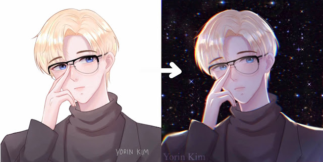
Today. I'm gonna show you. How to make your art looks nicer, better, professional
\(//∇//)\
Step1 : Multiply layer
Use 40-50% of black or dark color depending on the environment in your art fill the characters and change the layer’s blend mode to ‘Multiply’
Step2 : Erase
Use Eraser to remove areas where the light can reach. At this point, I usually remove it at the corner because I want the light source is placed behind the characters.
Step3 : Add
This is the step that we are going to give more ‘ light’ to the characters. Add a new layer and change it to ‘Add’ (blend mode) then use airbrush color bright color such as white or light yellow (depend on environment light again) to give those lights and make the characters’ face look brighter. Don’t forget to add background
*Tips* You can also add some different colors too, such as blue, red. This will make your art looks more naturally
Step4 : Chromatic aberration (moving)💙💗
This is my (Top secret) tips, you can found this in filter >artistic > chromatic aberration using this can do the red-blue effect on your character .duplicate all layer and use this filter to upgrade your art 😄😆
 |
| the result⬆⬆⬆ |
Step5: Overlay
the last step and last blend mode. I want to suggest. I use this blend mode in every work. This will help to make your work look softer and silky
this is a video while I do it hope this can help you understand more
Thank you for your attention and reading until here, I hope you enjoy my blog and I wish we can get through this crisis as soon as possible. feel free to leave comments. Stay safe 💚


ความคิดเห็น
แสดงความคิดเห็น